Logo and Annals of the ICRP Cover

Origins of the ICRP Logo: A letter from Jack Valentin
Basically, before 1997 when I was hired, ICRP did not have any graphical profile. The design of the journal cover (in brown) was entirely decided by the publisher, Elsevier Science Ltd.

ICRP Publication 78- Last Publication to Feature Original Brown Cover

ICRP Publication 79- First Publication to feature the ICRP Logotype

Cover of the Proceedings of the First ICRP Symposium
I felt it was important to change this situation, so in the spring of 1997, I raised this issue with the Chairman, Professor Roger Clarke. Roger, who was also the Director of the UK National Radiological Protection Board and therefore used to the concept of a graphical profile. He immediately grasped the importance and authorised me to organise a proposed profile. I then talked to our contact person at Elsevier, Dr Peter Harrison (Publishing Editor for the Annals of the ICRP). Peter felt that a re-vamping of the Annals might be useful in order to improve visibility and sales and so agreed to negotiate a possible new journal cover style.
Before commissioning any actual graphical work, I chatted informally with Roger and the then Vice-Chair, Professor C. B. (‘Charlie’) Meinhold. Both of them advised me strongly to avoid any picture/icon or similar and to obtain a logo based simply on the acronym, ICRP.
Based on this, I contacted a Swedish designer experienced in lettering, Mrs Gunilla Hansson. Within a couple of weeks, she had produced a number of variants of the letters ‘ICRP’ in the style we are now using, with different possible positioning and sizes of the letters ‘INTERNATIONAL COMMISSION ON RADIOLOGICAL PROTECTION’. She and I agreed from the outset that those letters should be upper case and in the Helvetica (Swiss 21) font, for two reasons: To use a well-known common font that was easily available for printers and in computers, and to retain some continuity with the ICRP letterhead that had been used immediately before my time. Gunilla’s drafts were also provided in three different colours: dark blue, dark brown, and bright yellow/orange.
In May 1997, when we met in the United States, I showed these first proposals to Roger and Charlie. They selected the logo variants that they preferred, basically the ones we are using now and in dark blue, and told me to go ahead and obtain actual logos and a draft Annals cover style.
Gunilla quickly completed the logos and proposed that the actual dark blue colour should be Pantone 286. She also suggested some Annals cover variants, all based on prominent use of the logo and on the ‘fading downwards’ pattern which became the new journal style. I discussed this with Peter and he accepted a revamping of the Annals along these lines. He and I also agreed that in addition to the dark blue style, it would be useful to have an alternative variant in the bright yellow/orange colour, for use with a perceived possible subset of the Annals. (The latter did not come into fruition at the time, and when ‘Supporting Guidance’ reports started to appear a few years later, it was decided for economic reasons not to invoke the yellow/orange covers there, I was very pleased however to see the first ICRP Symposium issue in a colour similar to the ‘alternative’ colour chosen years ago.
The new logotype and the proposed Annals cover designs were presented to the Main Commission by Peter and myself at the Commission’s meeting in Oxford, 12-13 September 1997. The Commission ‘endorsed’ the logotype and journal style. The verb was carefully selected in consultation with Roger to avoid any precedent implying that such decisions had to be taken by the Commission. We wanted to feel that the Chairman and Scientific Secretary could take the decision, but it is still obvious that the actual date of adoption of the current graphical profile was 1997-09-13. Letterhead, envelopes, etc were produced within weeks; the first actual issue of the Annals in the new style came only late in 1998 and the process was fraught with complications and disappointments before the printers finally got it right and we could approve the new style.
Jack Valentin
Former ICRP Scientific Secretary
Update on Annals of the ICRP Style
In 2016, ICRP published 'Proceedings of the International Workshop on the Fukushima Dialogue Initiative' (2016), the event having been held in December 2015 in Date City, Fukushima Prefecture, Japan. This was a first-of-a-kind issue in Annals of the ICRP, a proceedings issue not related to the ICRP symposium series. Like symposium proceedings issues, no number was assigned to distinguish it from 'regular' issues. In addition, to distinguish it from symposium proceedings issues, the cover was in a new style, with full wraparound artwork.
Following this, at a Main Commission meeting in Quebec City, Canada, in April 2018, Scientific Secretary Christopher Clement proposed a revised structure for Annals of the ICRP. The initial motivation was to rearrange the sections in each issue to make it more accessible and appealing to readers. In addition, a new cover art style was proposed, to make the publications more visually appealing and memorable.
The proposal included two different cover art styles, one for 'regular' issues, and another for proceedings issues.
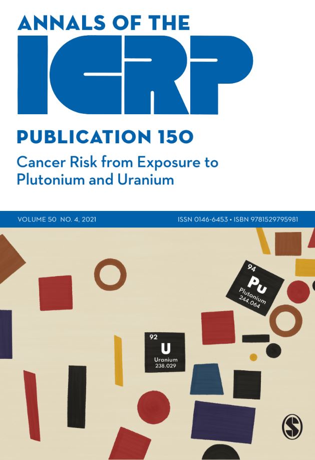
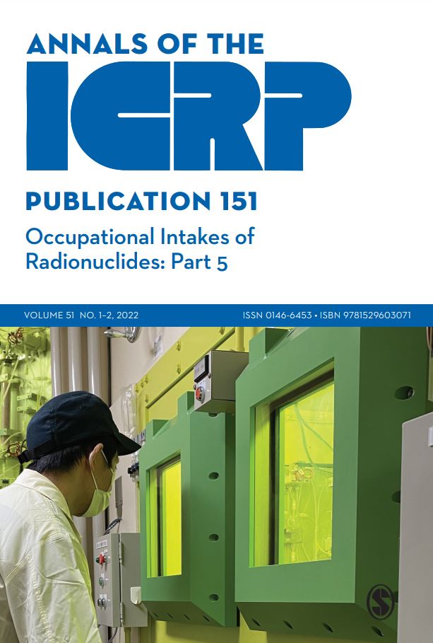
The first published in this new style was 'ICRP Publication 140 Radiological Protection in Therapy with Radiopharmaceuticals' (2019), with wraparound cover art on the lower half of the front and back covers, a blue line with volume, issue, and ISSN / ISBN information across the centre, and title information in blue on white background on the upper half.
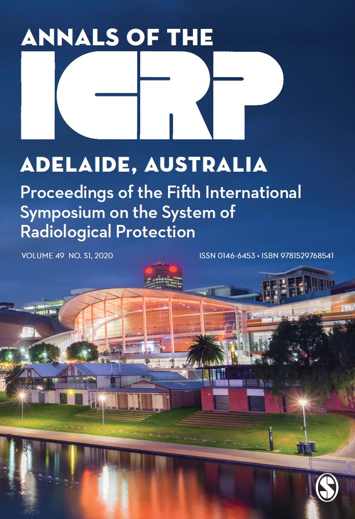
The first issue published in the new proceedings style was 'Proceedings of the Fourth International Symposium on the System of Radiological Protection' (2018) with full wraparound cover art, and a nod to the previous orange proceedings covers.
Since ICRP Publication 140, all issues of Annals of the ICRP have featured graphical covers in these two styles.
